C. Grey Hawkins
An illustrator, designer, & author who prioritizes using physical media in the production of publishing, editorial, & advertising work.
All Illustration
Color
Monotone
Graphic
Graphic Design
Other Things
Information
Contact/Social
Historic Georgetown, Inc.:
Brand Identity work for Historic Georgetown, Inc. (H.G.I.)
Beginning in 2021 I worked for Historic Georgetown, Inc. a non-profit historic preservation organization in Georgetown, Colorado which owns several buildings from the mid-to-late 1800s as well as conservation land surrounding the town. I was the resident everything-man, but when I wasn’t maintaining membership records, doing tech support, or checking on properties with massive water leaks, I was trying to revise H.G.I.’s branding to have a uniform presentable appearance. Other than where noted, I funtioned as the Art Director, Designer, and Ilustrator for every project.
The Logo
The very first thing I tackled after arriving at H.G.I. was “remastering” the Historic Georgetown, Inc. logo. The one they had been using was a very low-resolution copy that had gone through a 50 year long game of telephone since the original version was drafted in the 1970s, when the organization operated under a different name. It had been degraded with untold copies from sub-par sources and unprofessional attempts at digitizing it.
To repair the damage, I restored the best copy of the orginal art I could find from a 1978 member newsletter, and reset all of the typography using typefaces intended to feel less like the Microsoft Word special the previous logo had turned into. The organization’s archives are full of thousands of documents from the 1800s set in typefaces with names lost to time. I wanted to recreate a bit of that intrigue by modifying the typefaces I had available, so I rounded their sharp edges so that they wouldn’t feel overly fresh in a historical context.
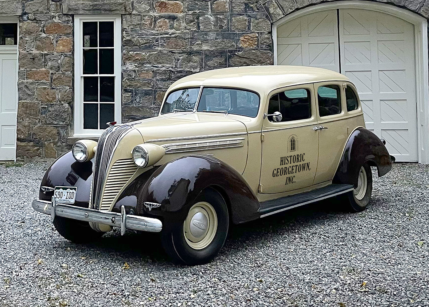
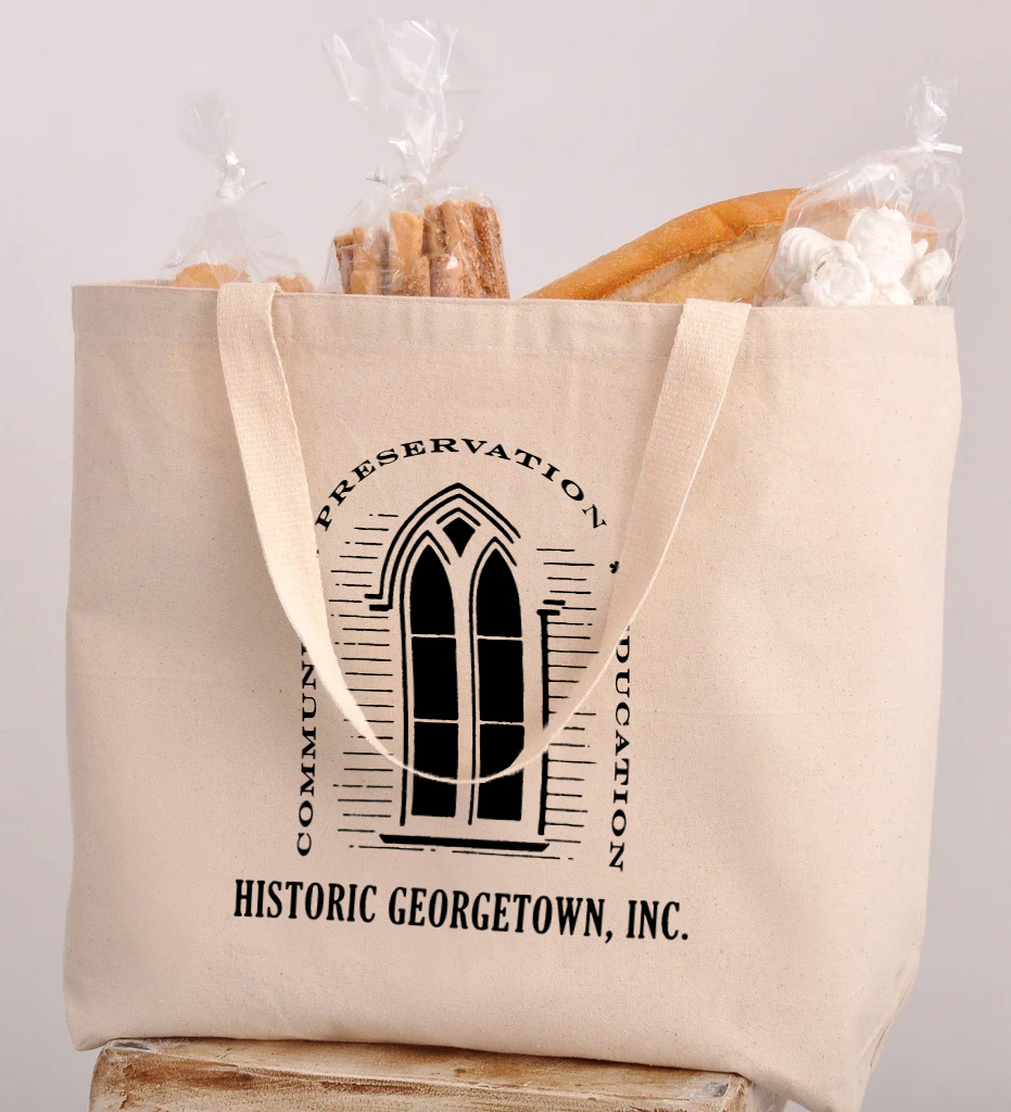
below: The refreshed logo as it would appear on the organization’s 1937 Hudson, and on a canvas tote full of stale bread.
![]()
![]()
The Logo
The very first thing I tackled after arriving at H.G.I. was “remastering” the Historic Georgetown, Inc. logo. The one they had been using was a very low-resolution copy that had gone through a 50 year long game of telephone since the original version was drafted in the 1970s, when the organization operated under a different name. It had been degraded with untold copies from sub-par sources and unprofessional attempts at digitizing it.
To repair the damage, I restored the best copy of the orginal art I could find from a 1978 member newsletter, and reset all of the typography using typefaces intended to feel less like the Microsoft Word special the previous logo had turned into. The organization’s archives are full of thousands of documents from the 1800s set in typefaces with names lost to time. I wanted to recreate a bit of that intrigue by modifying the typefaces I had available, so I rounded their sharp edges so that they wouldn’t feel overly fresh in a historical context.
below: The refreshed logo as it would appear on the organization’s 1937 Hudson, and on a canvas tote full of stale bread.
above: My remastered version of the logo.
below: What the organization was using when I arrived - this was the highest resolution available.

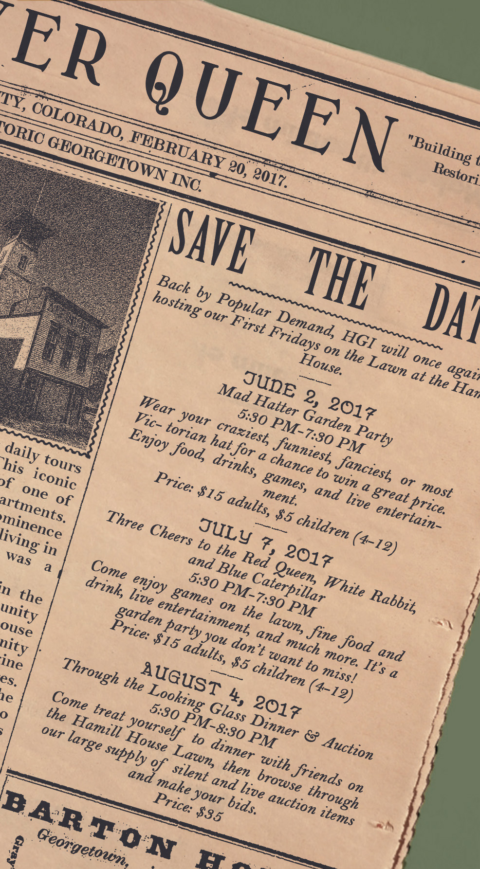

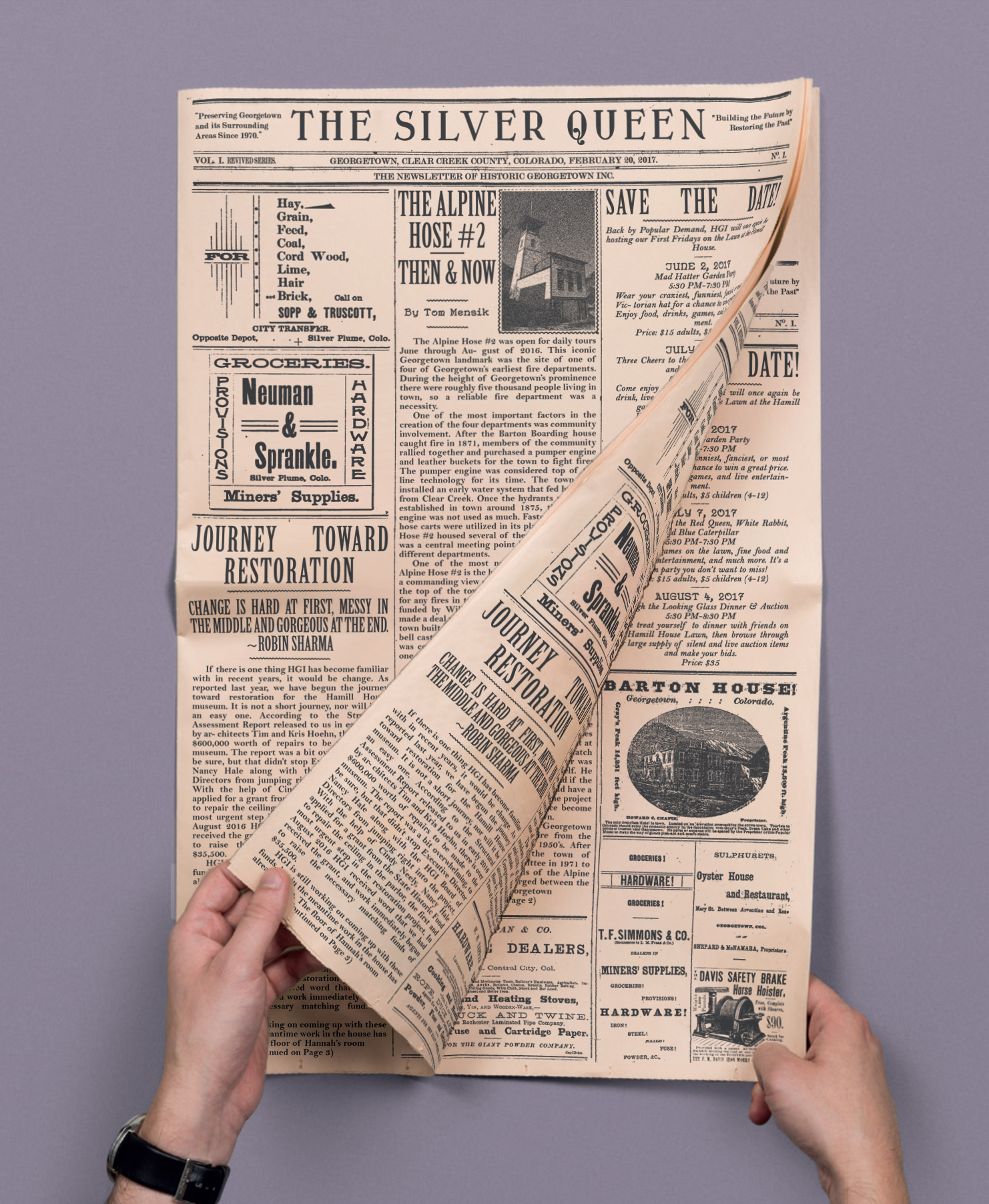
The Silver Queen Newsletter
Redesigning Historic Georgetown, Inc.’s newsletter was another priority. Before the early 2000s the newletter had been known as The Silver Queen, but the name had disappeared and the newsletter had only circulated a handful of times in the last 15 years.
I wanted to keep the theme of historic documents going, so I scoured local and online archives for as many local newspapers from the 1860-1900 period as I could find. I studied them carefully for the quirks in their layout, and built up a collection of reference material. In laying out the newletter I used many historic advertisements for local businesses from the era, many with names still recognizable to locals today. The long term plan is to replace the historic advertisements with similarly styled modern advertisements to help pay for the circulation of the newsletter. For printing I found a company that can print runs of under 1,000 copies on an antique looking pinkish newsprint.


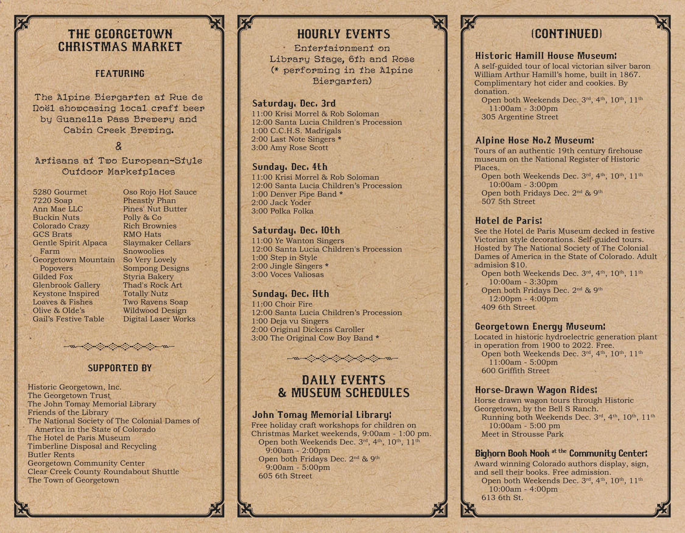
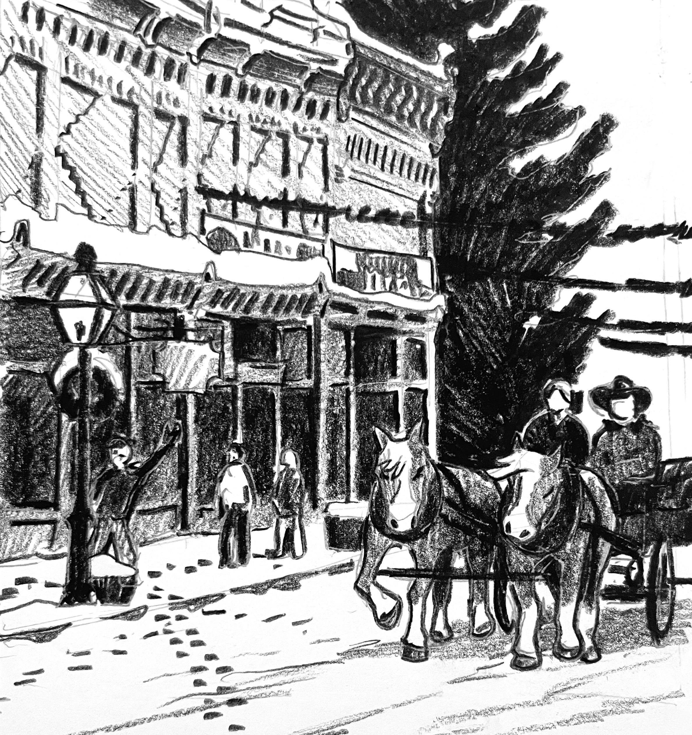
Georgetown Christmas Market
Historic Georgetown, Inc. has been responsible for making the Georgetown Christmas Market happen for the last 40 years. The holidays in general are H.G.I.’s busiest time of year, and most of the materials Grey produced during his time there were in relation to the holidays.
below: A tri-fold brochure for the Christmas Market. The map and illustration are also mine.


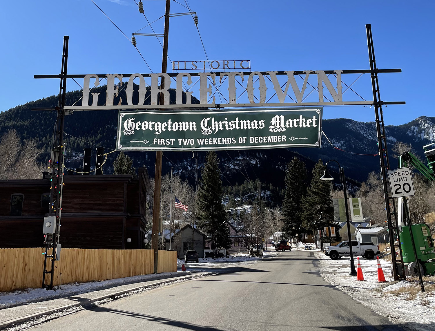
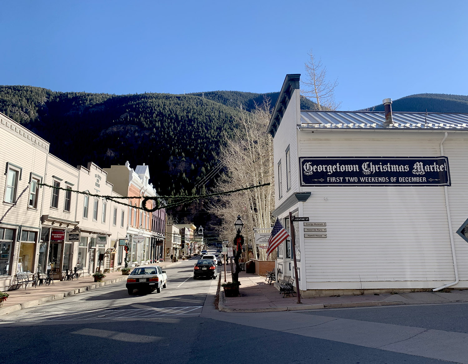
above & below: Various banners printed for the Georgetown Christmas Market.

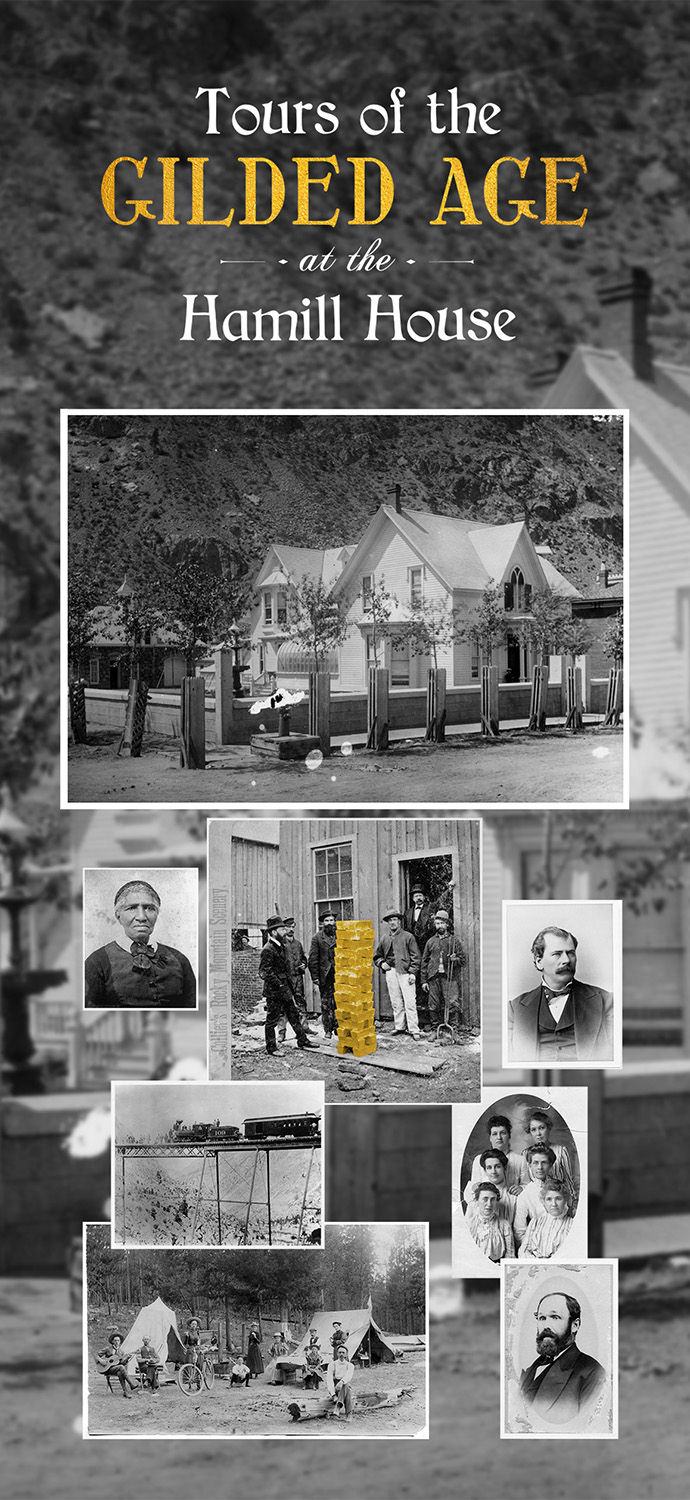
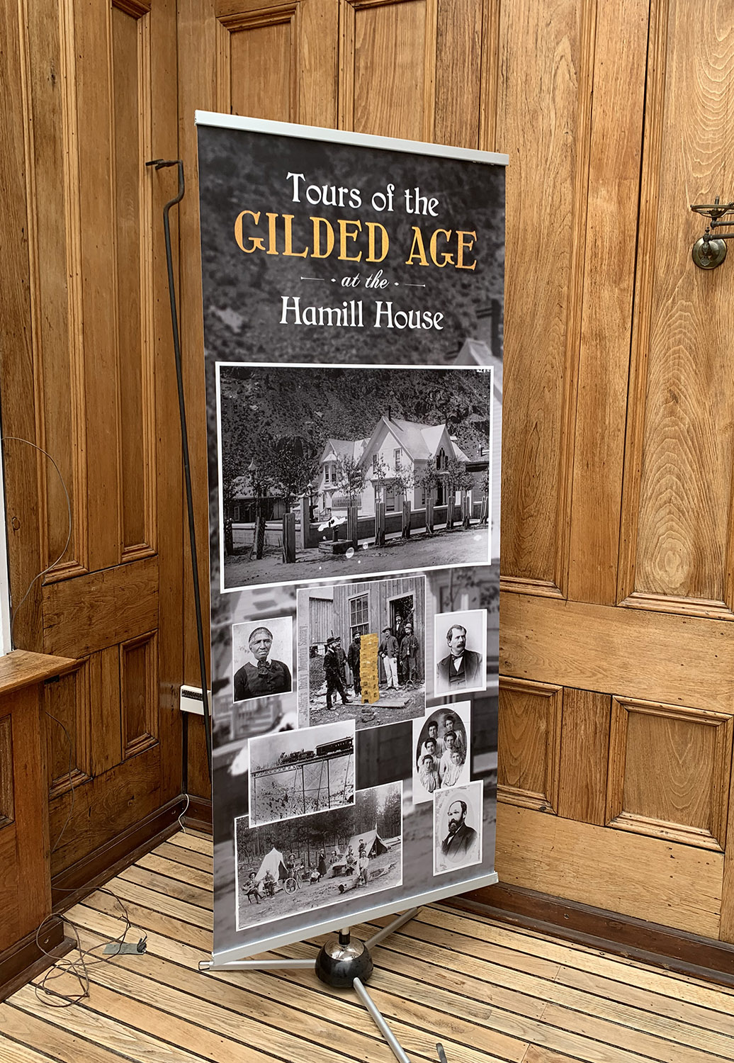
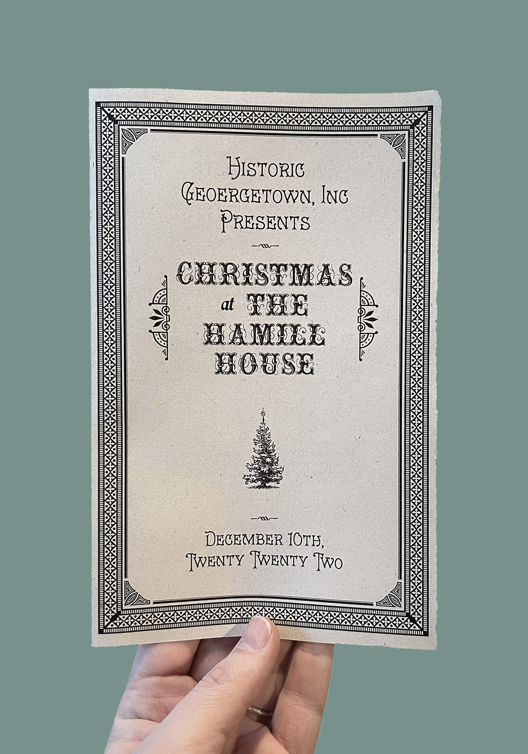
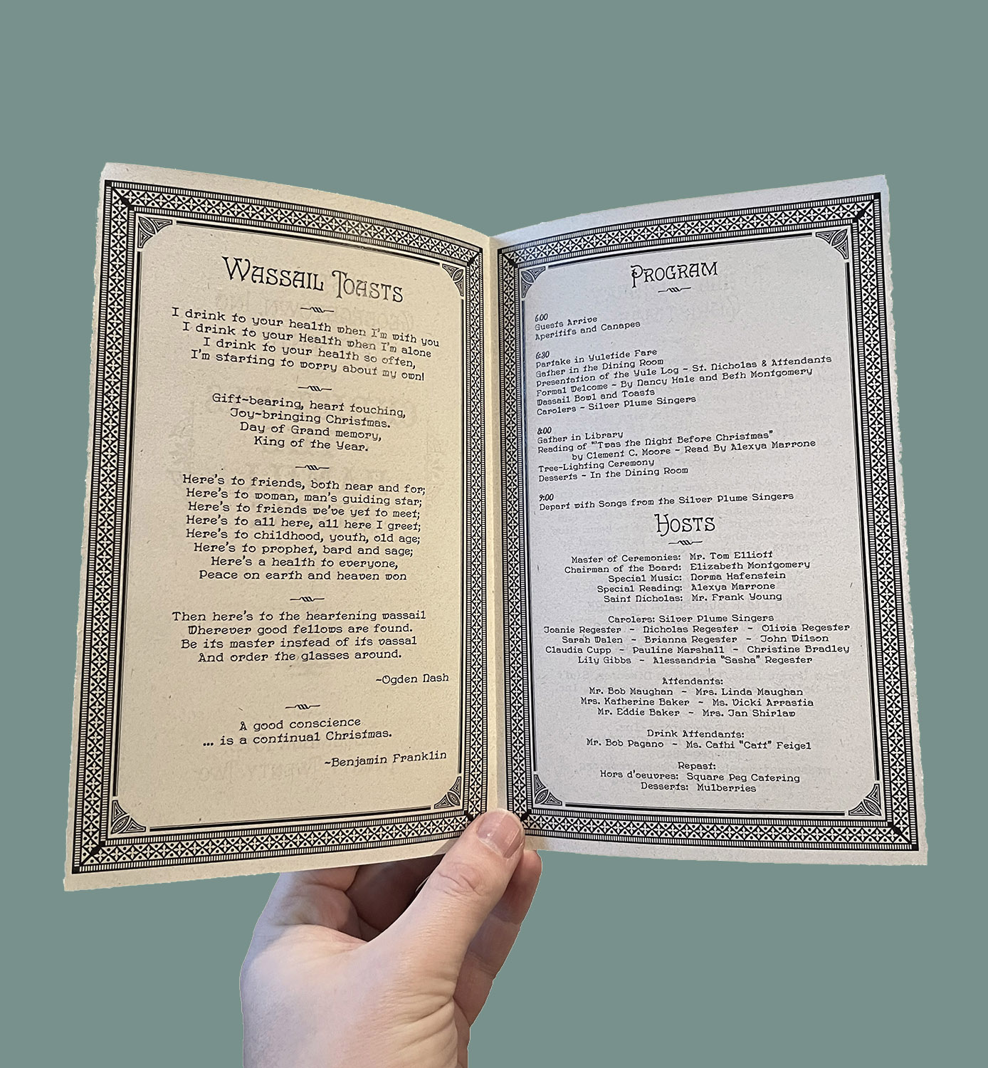
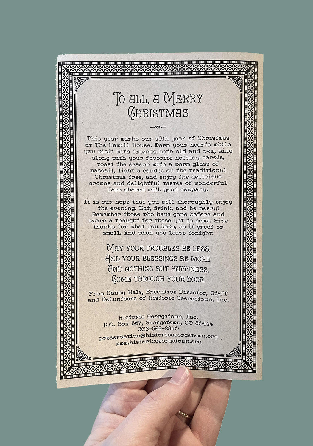
Christmas at the Hamill House
Program for a yearly formal dinner held at the Hamill House. Though not a part of the Christmas Market, it is one of H.G.I.’s stalwart holiday festivities.
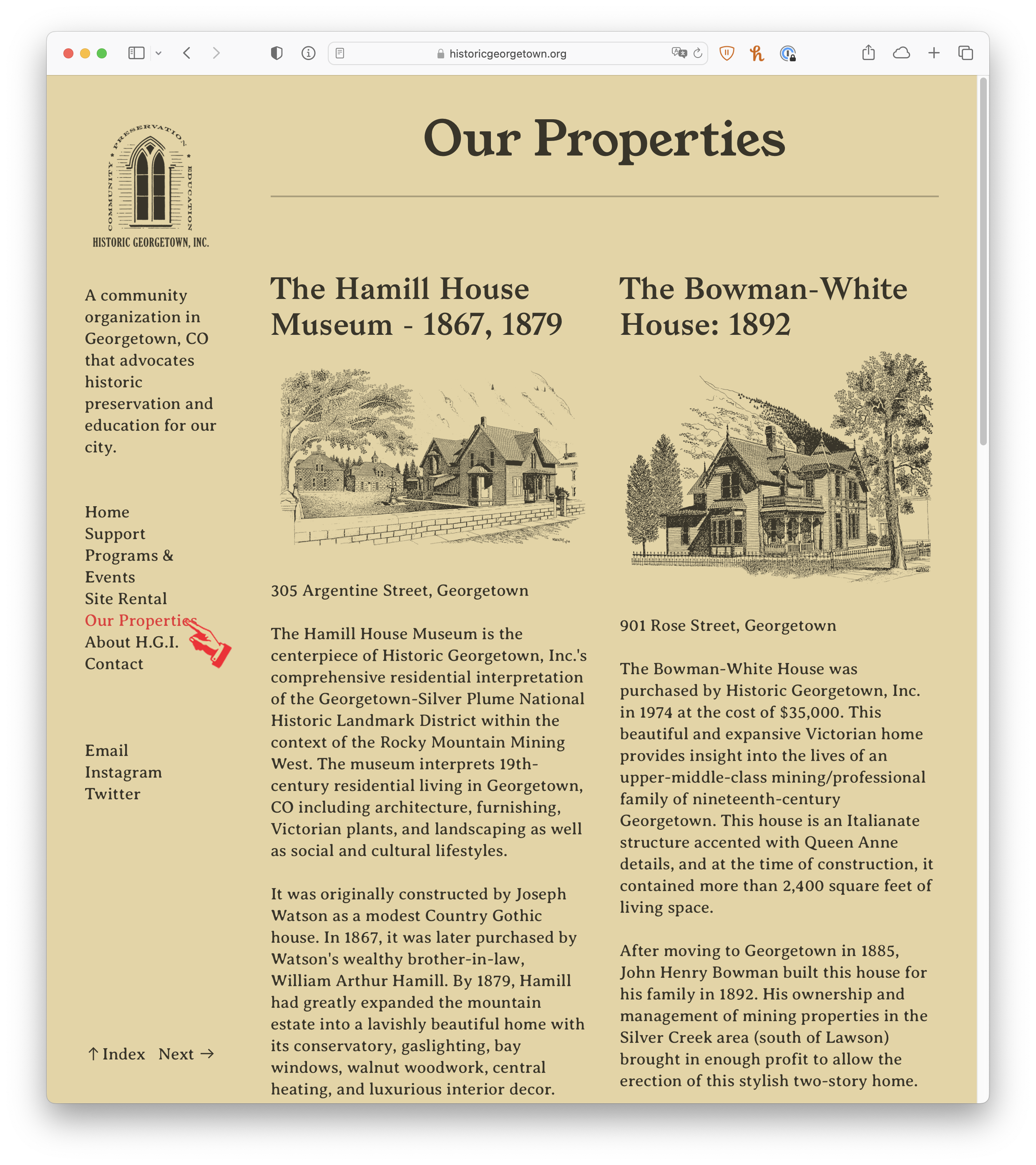
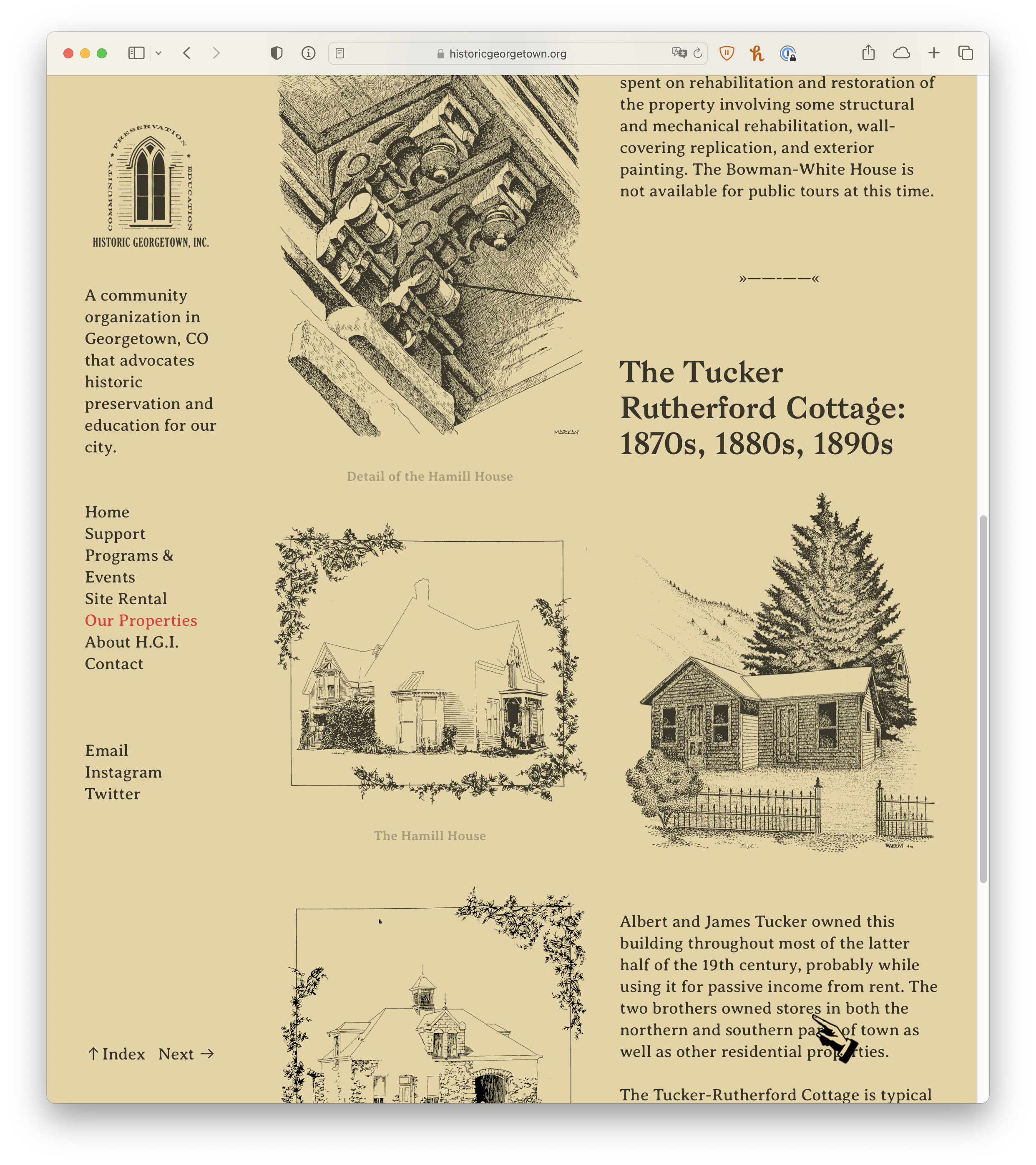
The Website
I also redesigned H.G.I.’s website. For once this is something where the illustrations aren’t mine. I had two main goals in this redesign:
1. Make the new site easier to edit than the existing one, which was a bloated monster on Wordpress with too many plug-ins.
2. Design something that would make a more memorable statement than the hundreds of other “historic preservation non-profit” websites in cyberspace. Historic Georgetown, Inc. hosts weddings on the grounds of the Hamill House, which means a large part of their target demographic are young couples looking for somewhere unique and tasteful to host their weddings. The regular ho-hum non-profit website wouldn’t do. I even made a memorable custom cursor.
I left H.G.I. before the new website could be implemented – unfortunately.
below & at right: Various pages from the redesigned website. A rare instance in which the illustrations aren’t mine.


Miscellaneous Printed Historic Georgetown, Inc. Materials.
Proof that I can spell words such as “donations” and even “splash.”